15 Best Practices for Responsible Responsive Web Design
Responsive web design is not just a matter of squeezing and stretching.
It’s about delivering one website countless ways depending on the width of the screen.
What to add? What to remove? How to prioritize what’s most important? What are the implications for search rankings? And how do you do all of that with just one code base?
It truly takes an expert to responsively code a website.
So we asked Tim Cross, one of AwesomeWeb’s finest responsive web designers, to give you insight on what it takes to build a proper, responsible, and responsive website.
Whether you hire Tim or decide to add responsiveness to your website yourself, keep this as a resource to know what needs to be done.
1. Hidden navigation menus.
On smaller screens hiding the main navigation menu is a good way of keeping layouts simple. An icon, text or combination of both indicates to the user where the menu is.
Your options include a simple drop down menu where the menu slides down and covers the main content below or the overlay method where the menu expands and covers the whole screen.

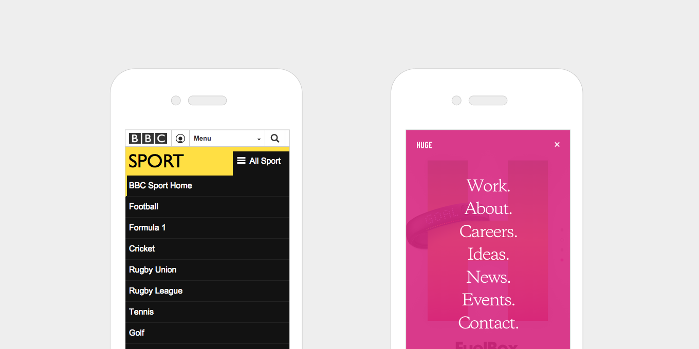
BBC Sport uses a drop down menu that expands when pressed. As they have multiple collapsed menus on the same page, they use different calls to action to help the user understand the hierarchy of the page.
Huge uses an overlay menu. They also use this menu style on the desktop view, keeping the burger icon visible and simplifying the content on the page.
2. Horizontal swipeable menus.
Another way to show menus on smaller screens is to keep it visible but let the content overflow off the edge of the screen. Showing part of the text cut off indicates that they can swipe to reveal.

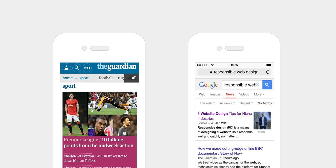
The Guardian uses a clear, horizontal scroll menu, with an extra call to action to see “All” – this appears as a drop down menu when pressed. A good example of applying different methods in the space available.
The horizontal scroll menu on Google is a list of plain text links, that overflow off the edge of the screen – a simple way of indicating more content to the user. Each text link has drop down menu that appears when pressed.
3. Give buttons and links large, clickable areas.
Rather than making buttons smaller on mobile, make them larger, so that they are easier to tap. In fact this doesn’t just apply to small screens, it’s good for them to be large whatever the device – from touch screen tablets to desktop PCs.
Large buttons improve usability. As well as making buttons larger, text links benefit from being larger. If, for example, you have a grid of news headlines, with a text link that says “Read More” inside each of them, rather than making this the link, make the whole content block a link, so that the user can click anywhere.
Easier to use. Better experience for all.

The Add to Basket button on the Oliver Bonas site is large, clear and stands out from the page with it’s contrasting colour.

The Pretty Green Energy site has big buttons, and large, clickable areas on content list items.
4. Balance font weights and sizes.
The size ratio between headers and paragraph text should be well balanced. Large headers don’t look good on mobile, especially if they stretch over a few lines. Everything should be resized appropriately.
Newer mobile devices have high-resolution screens, which makes text more legible and easier to read. You can afford to go a little bit smaller on mobile screens and increase the font sizes when you get to a larger display.

Nike use a chunkier weight of font on desktop, which works well in the banner. On mobile they lighten the font and reduce the size so that it fits on one line.

No Drama reduces it’s H1 titles on mobile so that they fit on the screen and don’t over power the page.
5. Optimal reading widths.
While making a layout wider on larger screens, it is important to consider the line lengths of your content.
If a line of text is too long it’s harder to read because it’s difficult to follow line-to-line. Similarly, having lines that are too short breaks the rhythm of reading as the eyes have to move back-and-forth too often.
Common practise is to keep line lengths at about 60-75 characters. This can be achieved by setting your text areas to have a max-width of approximately 500/700 pixels wide.

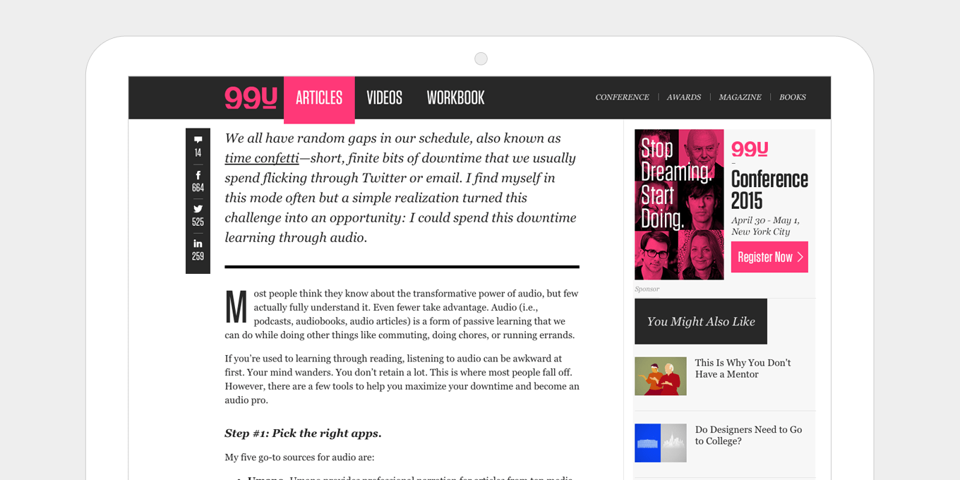
99u keeps their pages well balanced with optimum reading widths, simple share links and a well positioned sidebar that doesn’t detract too much from the article.

As well as having the right reading widths, The Guardian’s article layout is uncomplicated, with lots of white space and a clear, clutter-free sidebar.
6. Put important information near the top on mobile.
Show telephone numbers, contact info, buy now call to actions, etc. at the top on mobile. Mobile users want information quickly, but this also works well on any device.
Even with browser sizes being so varied now and the idea of the “fold” not really existing anymore, putting key call to actions at the top of the page is still important. For example, on a ecommerce product details page it’s good to have the “Add to Basket” button visible to the majority of users, without them having to scroll.

Metris Kitchens places it key information near the top on mobile as it is important for their users to see contact info (find a showroom) and conversion actions (request a brochure) clearly and quickly.
Ebay makes sure that the price and the buy it now button are clearly visible on mobile.
7. Change the order of content blocks when they collapse on smaller screens.
Decide what is more important to show first on a small screen, then change the content order around – this can be achieved through CSS (and sometimes JS if the layout is too complex).
If on desktop there is a text content block and an image block positioned next to one another, decide what is more relevant.
Or a sidebar and a content area on a page – on mobile if this collapses then the sidebar would be first, and would push all the content down the page, therefore it would be good to swap this around on mobile.

In this editorial content piece from Brown Thomas, the product info is positioned first on mobile. On desktop the content order is swapped around so that a lifestyle shot appears next to the product.

The Melanie F product details page places the product image first on mobile, then pushes up the product info to sit side by side on desktop.
8. Hiding content on smaller screens.
On mobile you can simplify the layout by hiding content that would be visible on larger screens, either by hiding it completely or using tabs and accordions to show/hide content. This declutters the page on smaller screens and lets the user see all the key info, with options to view more if they wish.

This product page on christianlouboutin.com simplifies it’s header and reduces product info on mobile, leaving the product image as the first content block.

On Selfridges the carousel of thumbnail images is removed on mobile, leaving just simple left/right arrows to swipe through.
9. Showing more content on wider screens.
Having a wider screen allows you to push more content further up the screen. More content is visible to the user straight away, before they have to scroll. Layouts can expand and accommodate more columns.

This portfolio grid view on Jimmy Gleeson increases it’s number of visible items as the screen gets’ wider, allowing more more content to be shown further up the page.

Smashing Magazine’s navigation layout is quite complex and changes a lot across different screen sizes. This is a good example of really thinking about the layout and maximising all space available per device and screen size.
10. Don’t forget about tablets in portrait mode.
Sometimes this orientation either falls in with the small mobile layout, which is more basic and not utilising all the screen space available, or it gets lumped in with a desktop layout which can make the content all squashed up.
Better use of media queries in your css can get the layout just right.

The layout on this Protest product details page still has a lot of information in a smaller space, without upsetting the proportions and spacing of the layout.

The Firebox product details layout doesn’t compromise anything in table portrait mode. Everything that appears on desktop is still there and the content is presented in a well balanced and simple way.
11. Replace enlarge image functionality with long scrollable gallery pages.
On small devices, having an enlarge image window doesn’t work if the image you are already looking at fills the screen.
For image galleries, use a long scrollable page, or a swipeable carousel with left/right arrows. The long scrollable gallery also works well on tablet and desktop.

This image gallery on Apple uses a long scrollable page on desktop as well as mobile. The captions are removed on mobile to simplify the layout even more.

This product gallery on UrbanEars appears on the same page and expands down after pressing a link. It’s keeps the fundamental good parts of a popup, ie. not going to a new page, but then presents the images in a better, more usable way.
12. Optimise the UX for touch screens.
Add swipe gestures to banners, menus, image galleries etc.
Touch screens are by nature intuitive to use, therefore we can be more subtle with navigational aides, e.g half an image off the screen on a carousel suggests that there is more content to come.
Hover events are inconsistent on touch screens. Disable these and replace with touch events. If the content to be displayed on hover isn’t critical and just fancy embellishment, then disable it on touch screens all together.

The hover states on the Born Group’s portfolio page are animated on desktop, and show the title of the project. As this information still needs to be accessible on touch screens the hover events are replaced with touch events – one tap to view info, then another tap to view the project.

The Made site added swipe events to it’s home page banner. They clearly thought about their users and utilises these touch events on the rest of the site, on places where it is natural to swipe – for example, on a carousel of products.
13. Use less images.
A lot of effects, like background gradients and button hover states, can be achieved by pure html & css. Pages load faster, which is especially good for mobile, and less time is wasted creating lots of graphics.
Using fonts for your icons means you don’t have to create images. They are scalable, have cleaner edges, load faster, and are good for retina displays. This optimisation works great on all devices and screens.

The desk.com site uses icon fonts well. Adding colour, which is as easy as changing a font colour, is a great way to add more impact to your page.

The Pretty Green Energy site uses large icon fonts for it’s section headers. Increasing the size of icon fonts is straightforward and does not require editing images.
14. Responsive videos.
This method allows for videos of any size to respond to device size automatically, without having to set explicit heights or widths on the video itself.
It’s achieved with only a few lines of css. This works well with videos inserted directly on the page and in iframes.

The videos on Anyilu stretch across the page and fill the whole space. This gives the page great impact. They respond and resize automatically on different screen sizes.

The embedded video’s on Brown Thomas use iframes and are fully responsive. No heights or widths are specified, allowing easy content management and quick page creation.
15. The fold no longer exists.
Devices are smaller, taller, wider, and longer.
It’s not important to cram everything at the top of the page. Let pages breath and expand with long, flowing content blocks and generous spacing.
People naturally scroll. By giving them more content below the “fold” you’re actually inviting them to be more engaged with the page and to read your content.

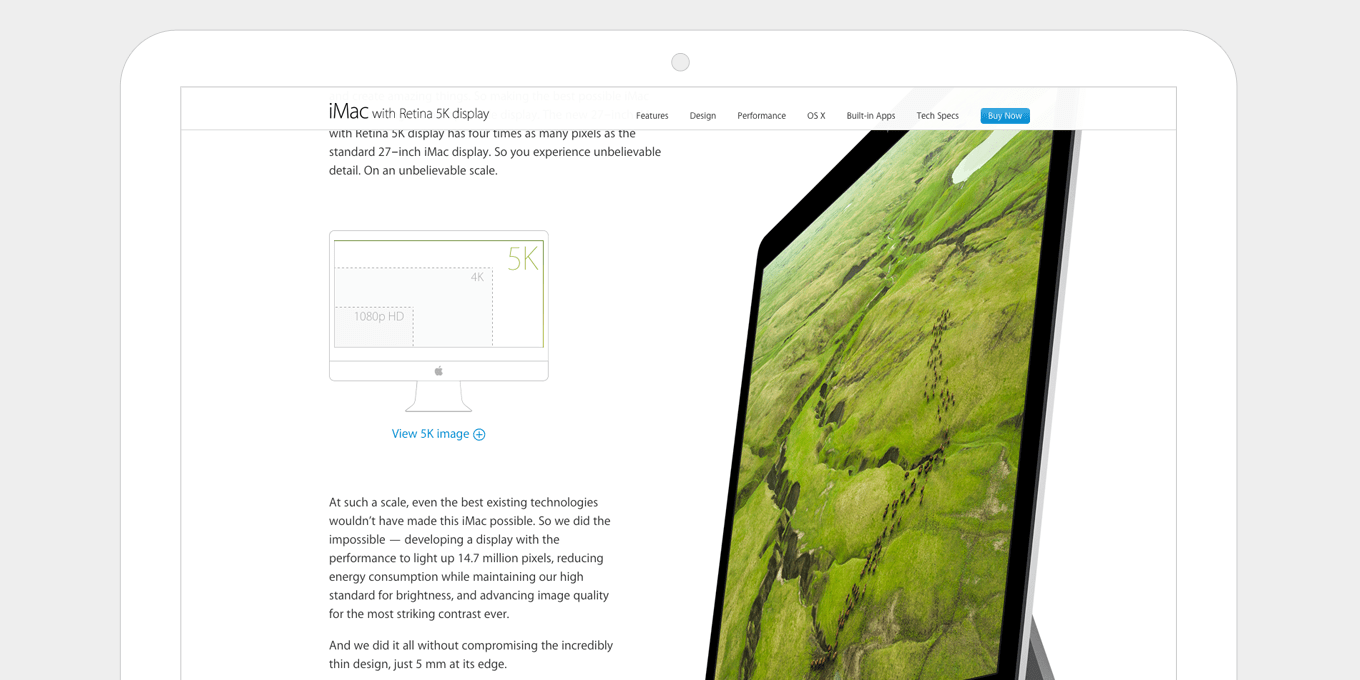
The iMac product page on Apple is a long, flowing page, with lots happening as you scroll. The experience pulls you in. They also utilise a fixed nav, so that the key call to actions, i.e. Buy Now, are still visible as you move down the page.

The Sonos product pages have a good balance between fixed width content text blocks and wider, full screen image panels. This keeps the page interesting and more engaging as you scroll. The spacing is well balanced without it being overcrowded.
Wrapping Up
Check your Analytics. I bet mobile traffic is a higher percentage than you think. And I bet it’s growing month-to-month.
If your site isn’t responsive, every single mobile user that comes to your site is having a bad experience.
Even if it is responsive, I’m sure there are a number of areas where it can be improved.
Responsive web design is my specialty. I can work on any website, WordPress, Modx or otherwise. My clients typically have at least 10,000+ monthly visits and I charge $1,500 – $3,000 depending on the complexity of your site.
Hire me once, I’ll do the job right, and you’ll never have to worry about a bad mobile experience ever again.
If you have questions, check out my portfolio and contact me here.
The post 15 Best Practices for Responsible Responsive Web Design appeared first on How To Make Money Online.
SOURCE: How To Make Money Online – Read entire story here.